![time-out-goes-free[1]](https://andycowles.com/wp-content/uploads/2013/06/time-out-goes-free1.jpg) A few weeks ago here on this blog, I served up a form guide to the PPA Cover Of The Year Awards that suggested the Time Out cover was a 100/1 outsider. Whilst I proclaimed it to be ‘Highly successful’ and an example of ‘unalloyed utility’, I clearly got the price well wrong!
A few weeks ago here on this blog, I served up a form guide to the PPA Cover Of The Year Awards that suggested the Time Out cover was a 100/1 outsider. Whilst I proclaimed it to be ‘Highly successful’ and an example of ‘unalloyed utility’, I clearly got the price well wrong!
The decision, as in all of the PPA cover award polls, is not made by ‘experts’, but by the public, who can vote online as many times as they like. I support this process, as it replicates the often random, superfast responses that anyone can go through when they choose a cover. Moreover, the cover is seen in the digital space first, which is a better reflection of the real world.
I recognise that it can produce distortions; for all I know every member of Time Out’s substantial staff might have been under strict orders to vote every single day. But even if they did (which I very much doubt), the cover was shortlisted on merit, so it had as much right to win as any other.
But the interesting thing here, is that judging a small digital image means that the things that make a cover work in the newssagents are all turned on their head. Conventionally sized coverlines cannot be read, but conversely, the whole cover is visible, as opposed to a small fraction. Multiple images to denote ‘value’ will have the opposite effect, whilst bold pictures will deliver even more impact. I wrote about this phenomena last year, when Sport won the same competition with their excellent Gascoigne cover.
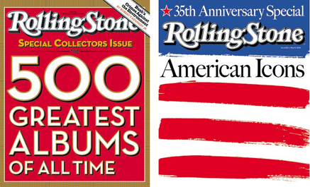
But the success of Time Out shows that it’s not just a clear image that can do well, but a powerful use of colour and words. This has been attempted many times on the newsstand of course, but with variable results. Some ideas work, others fail badly. As an illustration, here are a couple of covers that I did when I was the Art Director of Rolling Stone back in the day.
 I sometimes use these in my training work, as one was the absolute best selling issue of the entire year, the other was the absolute worst, selling half the number of copies. It’s not too hard to pick the winner, but for those who remain curious, I’ll give the answer on this blog later on this week.
So why did Time Out do so well?
Again, I wrote a little about this cover when it was published, as part of a bigger story about The Big Issue’s response to another free magazine on the streets.
It is a ruthlessly simple piece of work. A clear statement of their new publishing model, delivered with real brevity and total clarity. Red is good of course, but all the heavy lifting lies in the words ‘Take Me, I’m Yours’. The link to the old Squeeze lyric is handy, but Time Out were smart enough to pinch a little of Difford and Tilbrook’s genius. To be able to describe an entirely new relationship between ‘Me’ and ‘You’, with the promise of sex, ownership, and no coverprice is a tough task. But to do it in four really short words is something else.